From "lookup tool" to "lookup and manage"
Stickiness is a series of small earnings, not one big launch. A sequence of table moves quietly reshaped what users thought the product was for — and the pricing-page visits followed.
01Context
ZoomInfo Lite's perception was a lookup tool: find a contact, leave. Stickiness was the problem. Contact management was the bet to change that — surfaces that gave users a reason to come back to a contact, not just find it.
02My Role
Team lead. The contact-management designer reported to me. I owned the call to ship multiple small moves over months rather than a single "new section" launch, and to tie each move to a downstream revenue signal — not just engagement.
03The Bet
Stickiness is a series of small earnings, not one big launch. Each micro-feature had to earn its keep against a downstream metric we cared about: pricing-page visits.
04Decisions That Mattered
Redesigned the My Contacts table as an active workspace.
Inline status, notes, contact updates. Turned a passive lookup into something users could act on. The table stopped being a list and started being a small CRM.
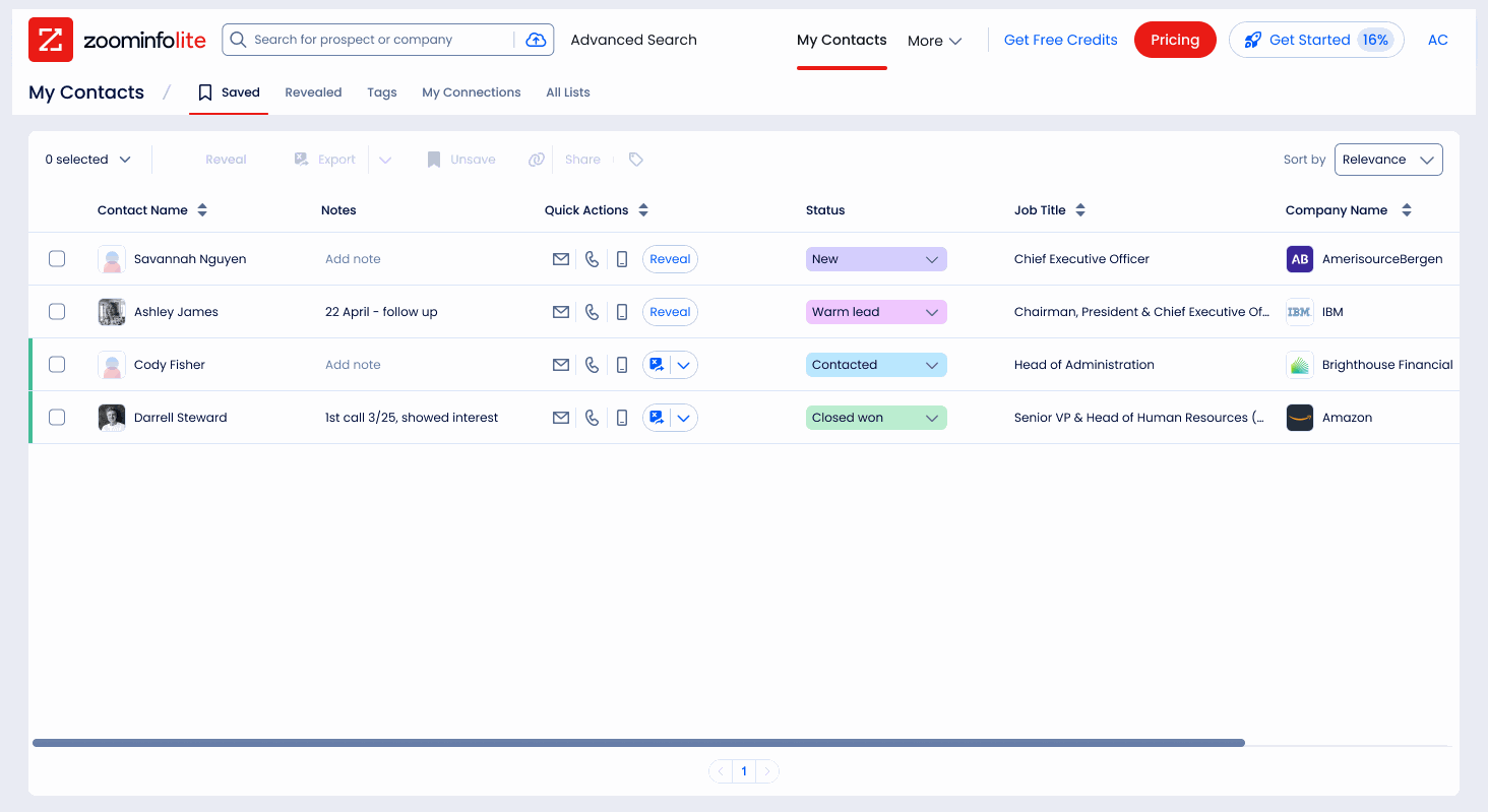
After: the Saved view as a workspace. Inline notes, colored status (New, Warm lead, Contacted, Closed won), and quick actions per row.
Made Save the default of Reveal (97% pairing).
Instead of a separate step, saving became the natural default of revealing, without forcing it as something users couldn't undo. The result was near-universal: 97% of users who Revealed a contact also Saved it. A counter on the Saved tab signaled "you have unfinished work here."
Added side-pane profile pages.
A second-screen surface so users could work two contacts in parallel without losing context. Small change in chrome, big change in how the product felt to work in.
Tied a single behavior — status updates — to a revenue signal.
Among users who updated a status, 47% raised their hand for sales and 22% purchased SalesOS. We made status update the most surfaced action in the table, because it correlated with revenue, not because it was the most-used action.
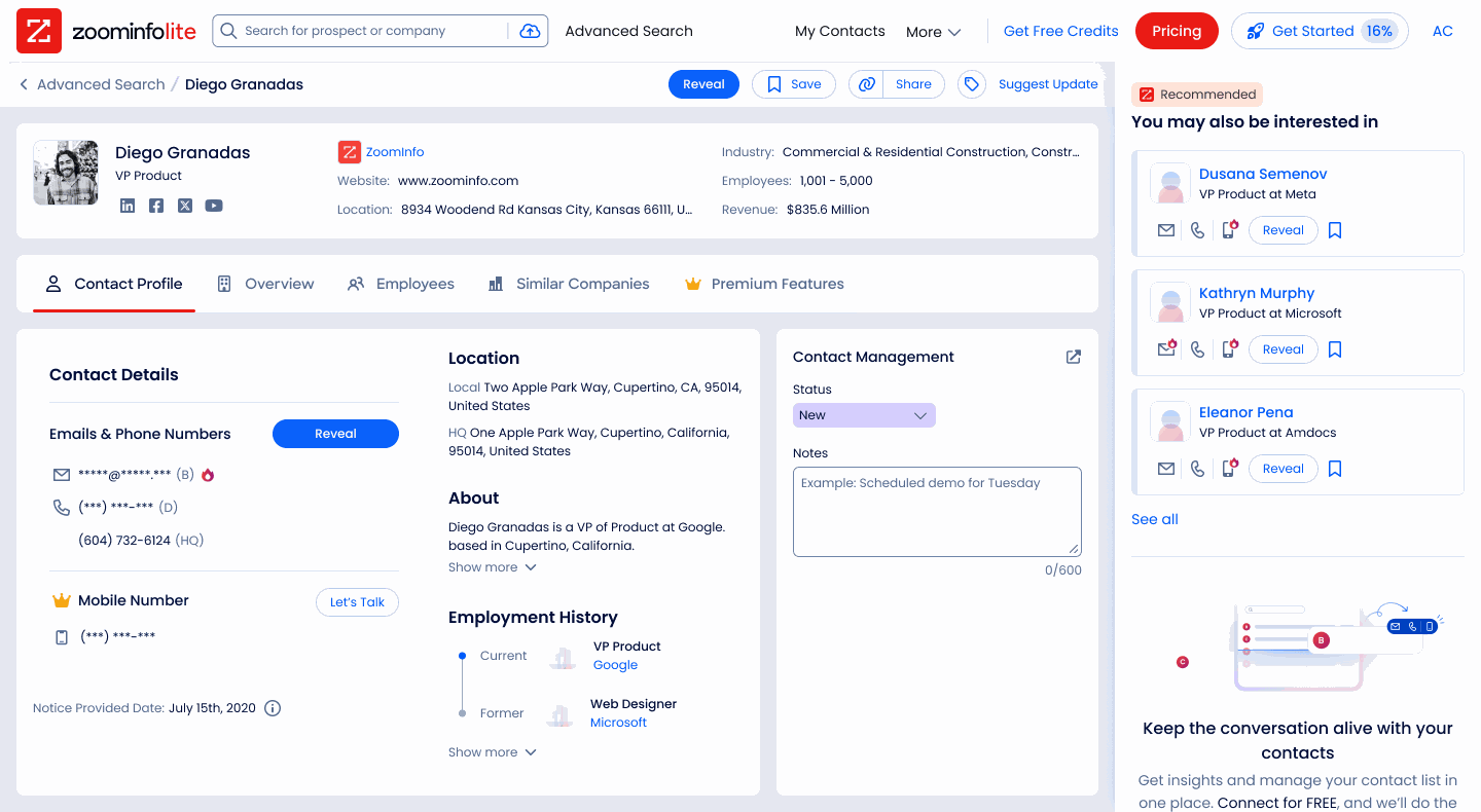
The contact profile, with a Contact Management panel: set status and keep notes on the person, the same manage actions that live in the table.
Drove discovery with a coachmark walkthrough.
The surfaces only mattered if users found them. So the nudges fired at the three moments that lead to managing a contact: saving from Advanced Search, managing from a profile, and setting status in the Saved table.
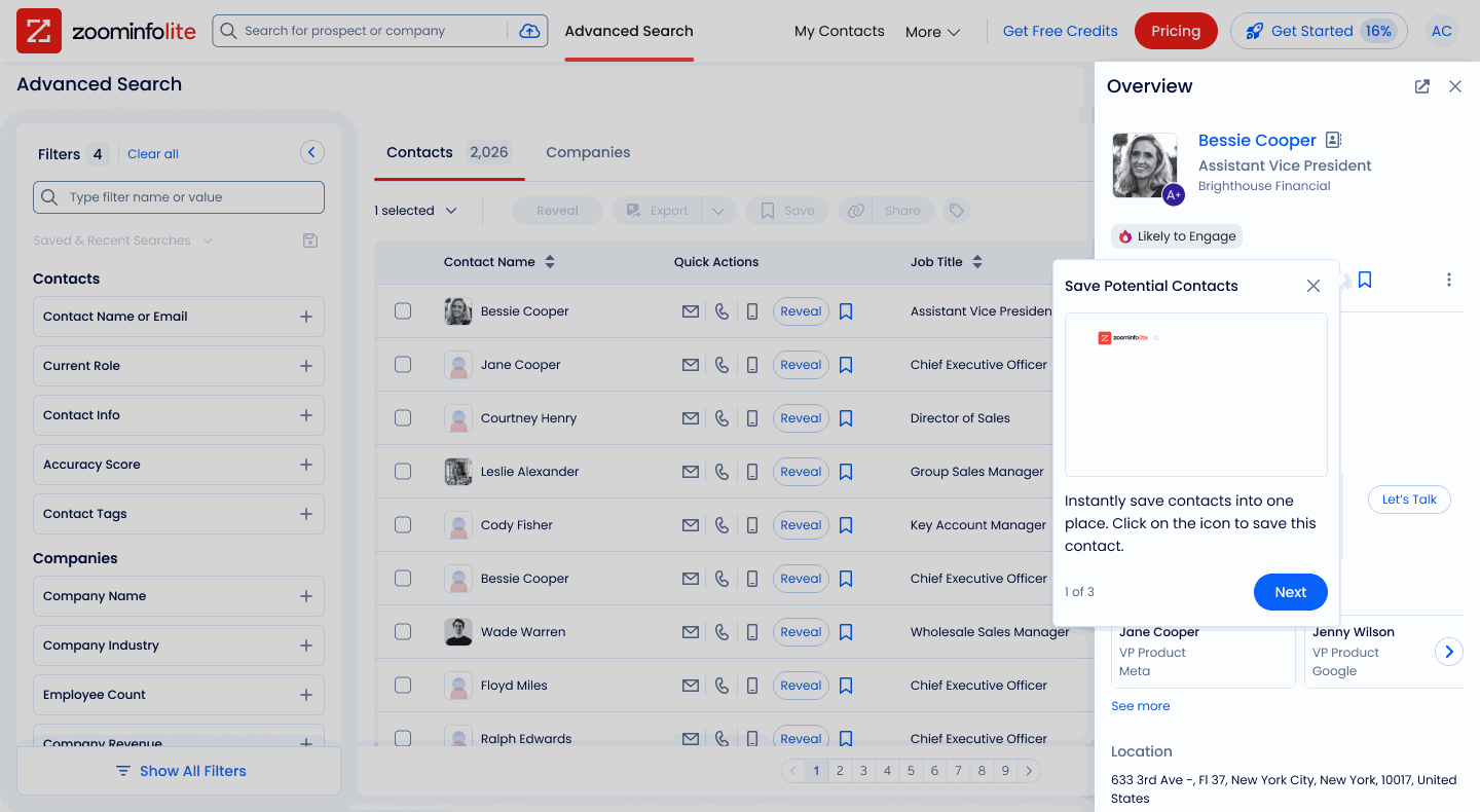
At search: "save contacts into one place."
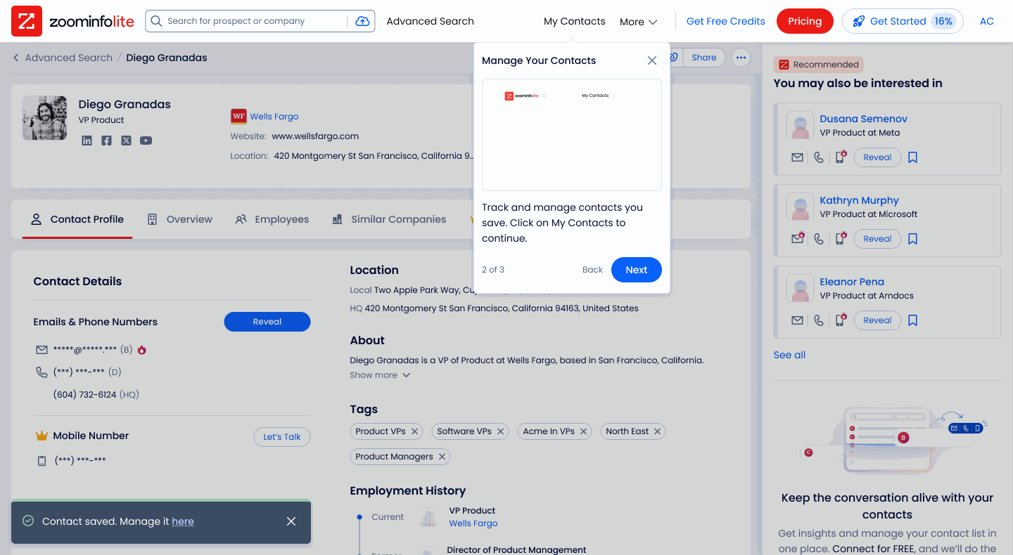
On a profile: "track and manage your contacts."
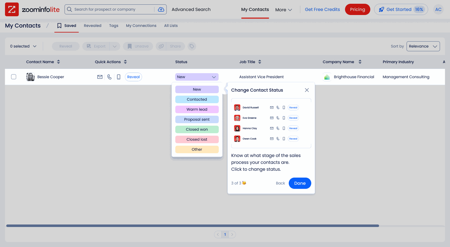
In the table: "know what stage each contact is at."
05Outcome
Reveal → Saved tab adoption +305% (4.6% → 18.5%). Tab clicks +81% (728 → 1,323). Status updates +66%. Save users were 294% more likely to visit pricing. Among status-updaters: 47% raised hand, 22% purchased SalesOS.
Reveal → Saved tab, and what status updates correlate with
06What I'd Do Differently
Even with the walkthrough, awareness stayed the weak point. Under 20% of users who Revealed a contact ever reached the Saved tab. The features worked once users found them, and the coachmarks helped, but I'd have invested in discovery earlier and harder. Designing the in-product nudge is as important as designing the surface it points to.